Hybrid vs. Responsive
Responsive
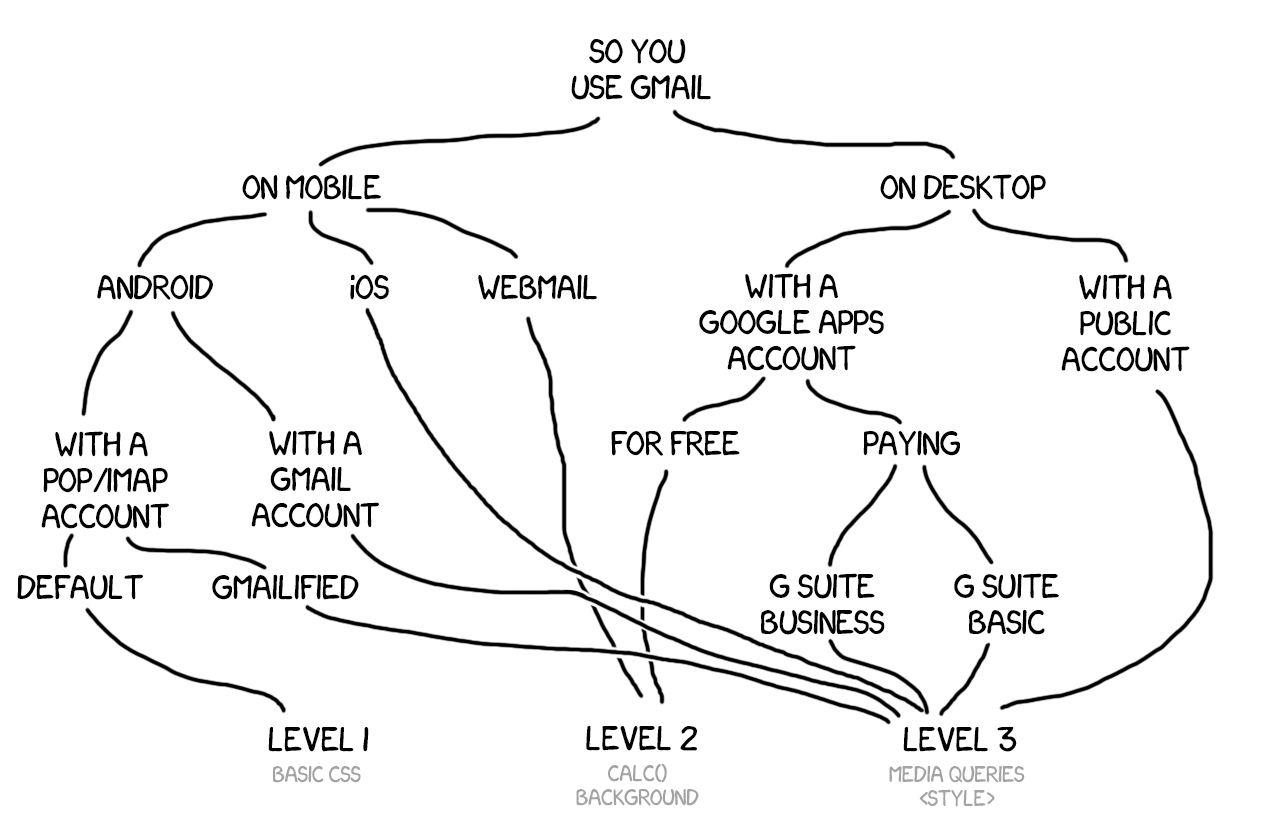
Media queries are a standard way to optimize layouts for small screen sizes on the web. In the email world, though, there are some small screen scenarios where media queries aren’t supported (eg. some Gmail Apps) or only partially supported (eg. some Android device native mail apps).
| Class | Description |
|---|---|
stack-column | Makes table columns 100% wide and stacks them in source order. |
stack-column-center | Makes table columns 100% wide, stacks them in source order, and centers everything inside. |
Hybrid
Hybrid design uses inline-block, max-width, min-width, and ghost tables stack columns without media queries while imposing a fixed, desktop width for Outlook.
<tr>
  <td>
    <!--[if mso]>
    <table role="presentation" cellspacing="0" cellpadding="0" border="0" width="100%">
    <tr>
    <td width="300">
    <![endif]-->
    <div style="display:inline-block; width:100%; min-width:200px; max-width:300px;">
      Column 1
    </div>
    <!--[if mso]>
    </td>
    <td width="300">
    <![endif]-->
    <div style="display:inline-block; width:100%; min-width:200px; max-width:300px;">
      Column 2
    </div>
    <!--[if mso]>
    </td>
    </tr>
    </table>
    <![endif]-->
  </td>
</tr>
In this example, the two columns will display side-by-side on wide, desktop displays and stack on top of each other in narrow, mobile displays.
Once a hybrid baseline is set, media queries can be used to fine-tune a responsive email layout further in email clients that support it.
🙏 Fabio Carneiro’s TEDC15 talk files, as well as Action Rocket's and Nicole Merlin's articles on hybrid email design.